
Summer is the perfect excuse to bring a little more color into your bedroom.
While blue and white will always be a classic summer pairing, they’re far from your only option. This season, we’re loving combinations inspired by lemonade stands, picnic blankets, coastal sunsets, blooming gardens, and colorful vacation towns.
Whether you prefer a bedroom that feels cool and peaceful or bright and full of personality, these five palettes offer plenty of ways to make your space feel ready for summer.


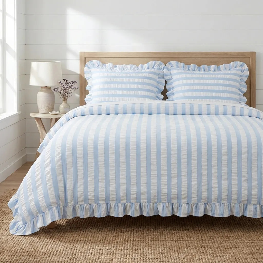
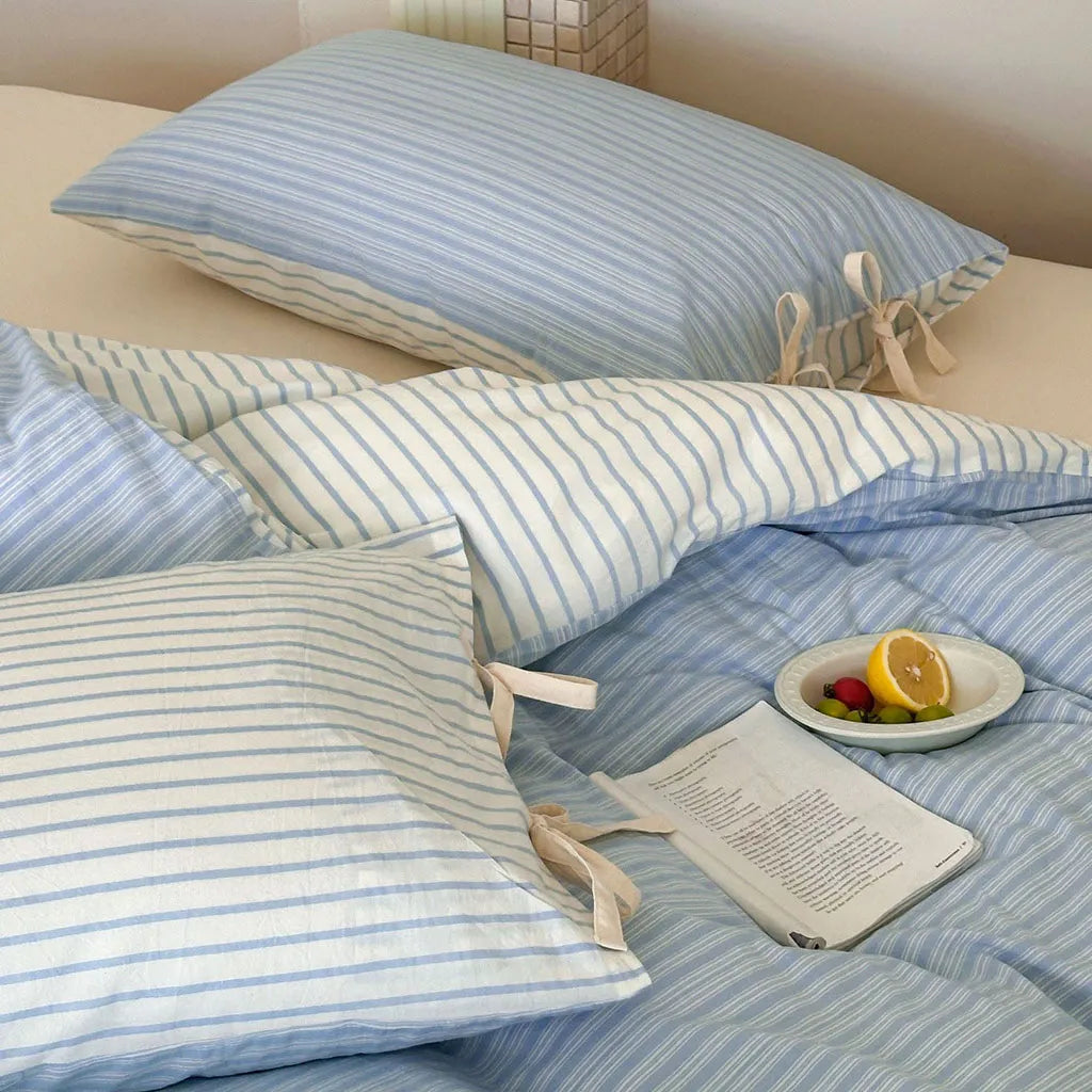
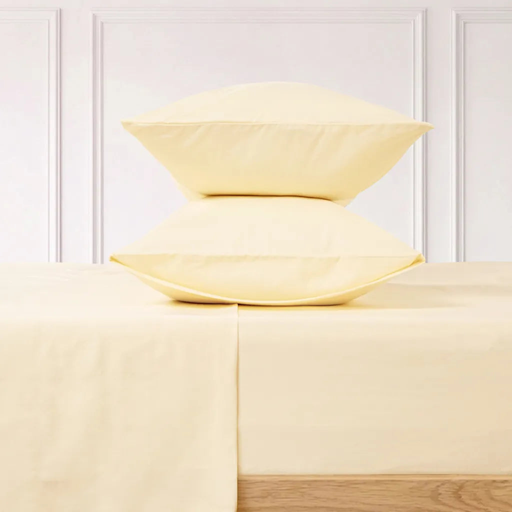
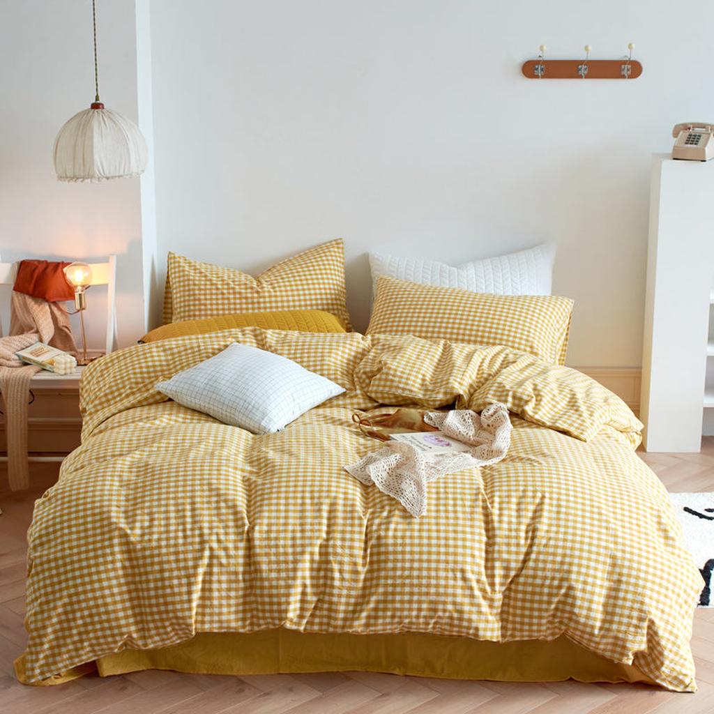
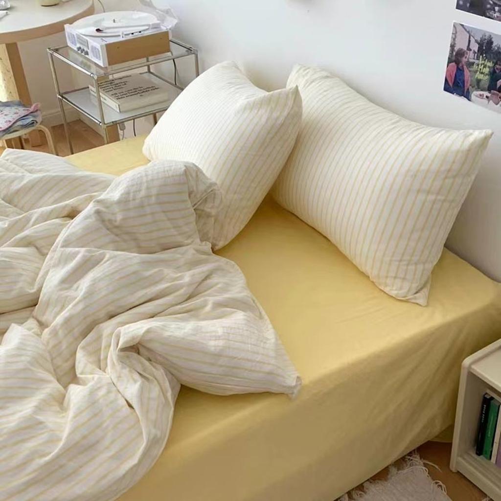
1. Butter Yellow + Whispy Blue
Think open windows, clear blue skies, clean sheets, and a cold glass of lemonade on a warm afternoon. Lemonade yellow and whispy blue capture that feeling perfectly.
Whispy blue works beautifully as the calming base of the room. It has the fresh quality of blue without feeling too cold or serious. Lemonade yellow brings in a touch of sunshine, keeping the space cheerful and inviting.


The key is not to use both colors in equal amounts. Let the blue take up more visual space, then bring in yellow through one or two smaller details. This keeps the room restful while still giving it a fun summer lift.
Try a pale blue duvet cover with crisp white sheets, then add a lemonade yellow cushion or a small floral pillow. Blue striped bedding is another easy option, especially if you want the room to have a relaxed coastal feeling without leaning too heavily into a beach theme.
This is one of our favorite combinations for anyone who wants a bedroom to feel cooler and brighter at the same time.
Discover with VANSILK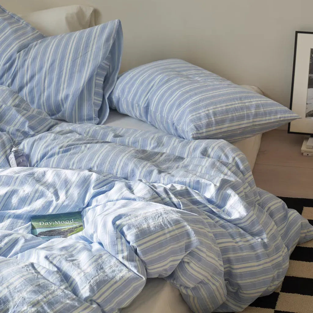
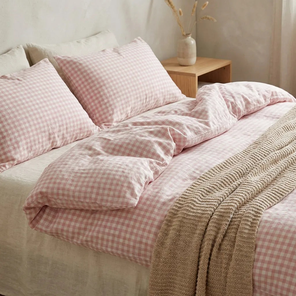
2. Powder Pink + Citrus Yellow
Powder pink and citrus yellow feel like pink lemonade, gingham picnic blankets, fresh fruit, and long afternoons outside. It’s a cheerful combination that feels very summery without relying on a traditional coastal look.
Powder pink keeps the bedroom soft and easy to relax in, while citrus yellow brings a more energetic touch. Together, they create a space that feels youthful, nostalgic, and full of charm.
This palette works especially well with pattern. Gingham, tiny florals, soft stripes, and subtle ruffles can make the colors feel collected and cozy rather than overly bright.


You might start with a powder pink duvet cover or pink pillowcases, then layer a yellow gingham blanket across the foot of the bed. Another option is to use pink as the main color and introduce yellow through small floral details.
Personally, I love this combination in a cottage-inspired bedroom. Add a gingham cushion, a cream throw, a warm bedside lamp, and a small piece of fruit-inspired artwork for a look that feels playful but still put together.
Discover with VANSILK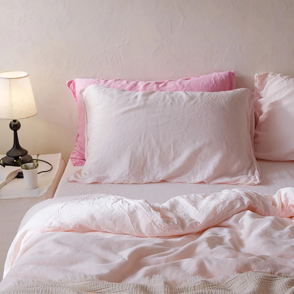
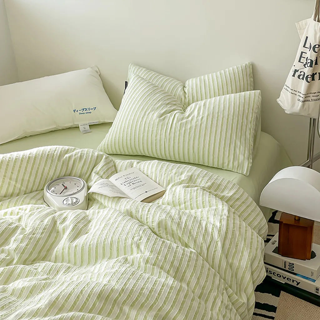
3. Sage Green + Burnt Orange
Not every summer bedroom has to be pastel. For something warmer and a little more grown-up, try pairing sea-glass green with burnt orange.
Sage green brings in the freshness of the coast, while burnt orange feels like terracotta, warm sand, and the last light of a summer sunset. The combination is colorful, but it still feels grounded and natural.


A sage green duvet with a single burnt orange cushion can be enough to establish the entire palette. You could also begin with neutral cream bedding and layer green and orange accents on top for a softer version of the look.
This combination is perfect for anyone who likes coastal decorating but wants something beyond the usual navy-and-white stripes. It can feel Mediterranean, resort-inspired, or slightly bohemian depending on the patterns and textures you choose.
Discover with VANSILK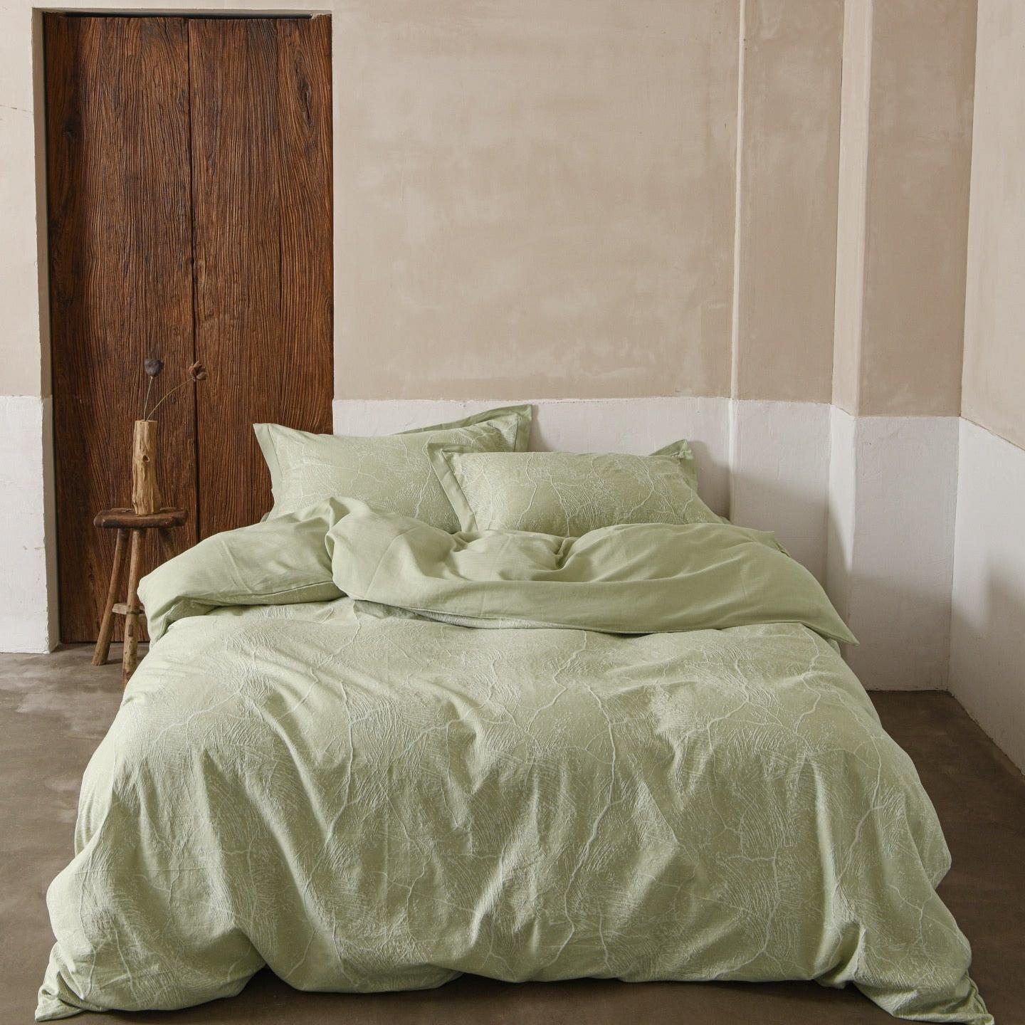
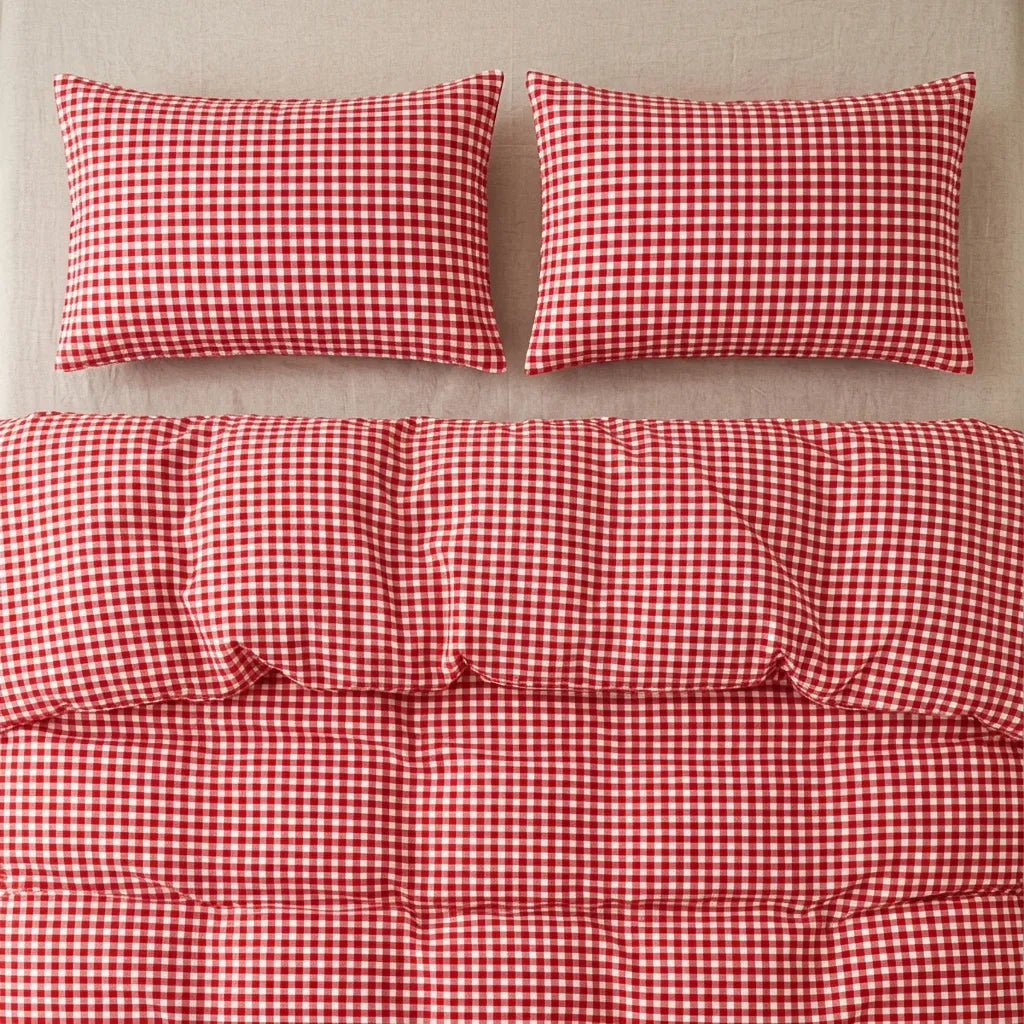
4. Blush Rose + Tomato Red
Blush rose and tomato red bring a little more drama to the summer bedroom. The pairing feels like blooming roses, fresh tomatoes, garden lunches, and colorful flowers gathered from outside.
Blush rose creates a soft, romantic foundation. Tomato red adds a sharper contrast that makes the whole room feel fresher and more confident.
The trick is to treat tomato red like a flower in a garden. A little goes a long way.


Start with blush bedding, then add red through a floral pillow, contrast trim, a small blanket, or fresh flowers beside the bed. You don’t need a large red duvet or a bright red wall to make the color noticeable.
While blush pink can sometimes feel very delicate on its own, tomato red gives it personality. The final look is still romantic, but it feels much more lively and unexpected.
Discover with VANSILK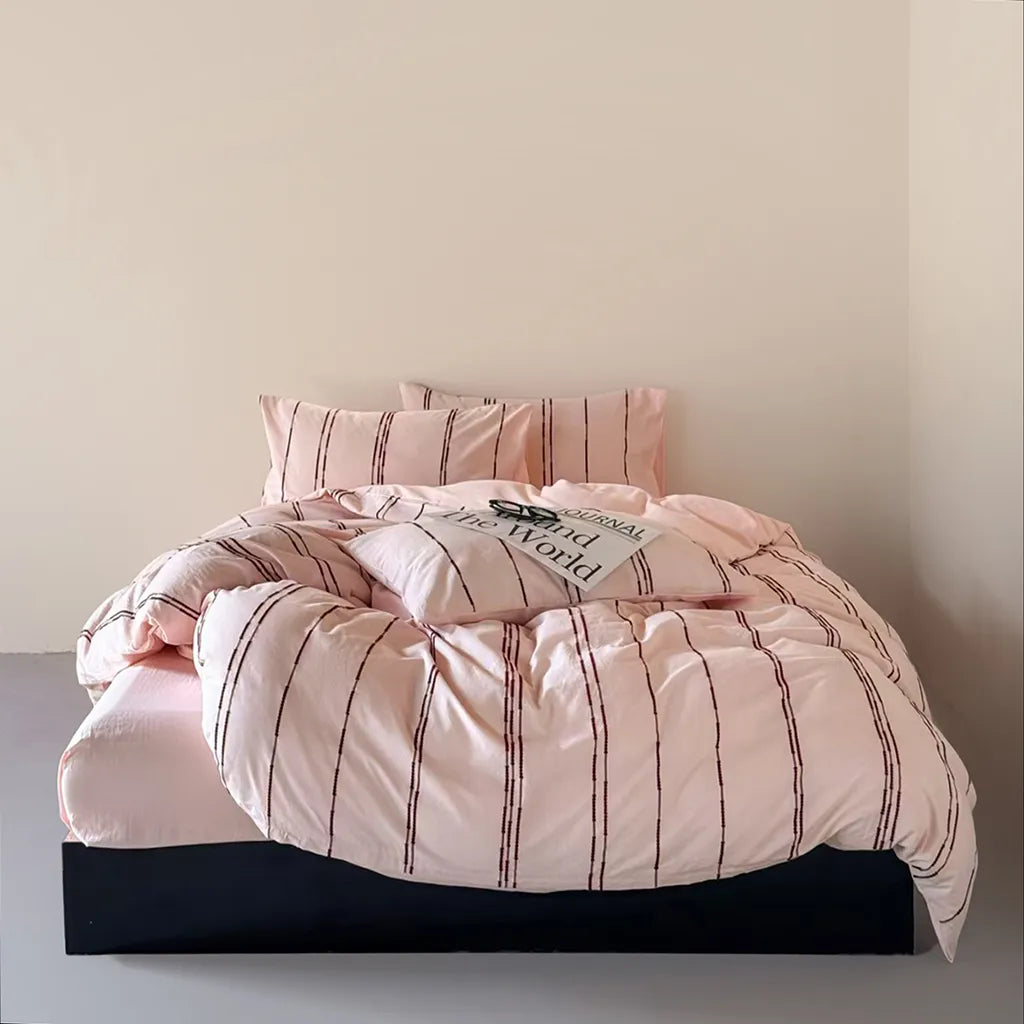
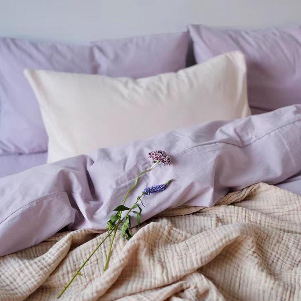
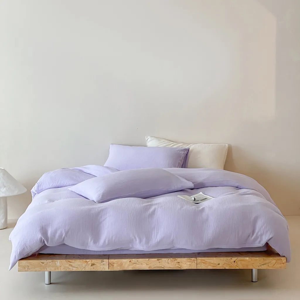
5. Soft Lavender + Ocean Blue
Soft lavender and turquoise blue feel like a summer trip in color form. Lavender brings a dreamy, restful quality, while turquoise adds the bright freshness of swimming pools, seaside cafés, and colorful beach towns.
It’s an unexpected pairing, which is exactly what makes it so fun.


To keep the room from feeling chaotic, choose one color as the main shade and use the other as an accent. For example, you could style soft lavender bedding with one turquoise cushion. You could also reverse the combination by using pale blue bedding with lavender floral pillows.
You can keep the look calm with solid bedding and just a few colored accents, or make it more playful with cabana stripes, retro florals, contrast edging, and colorful checks.
Discover with VANSILK

A summer bedroom refresh doesn’t have to follow one set color formula. Your space can feel cool and crisp, warm and earthy, soft and romantic, or bright and playful.
Have you already tried a new color pairing in your bedroom this summer? We’d love to hear which shades you chose - and which of these palettes you’d be most excited to bring home.


