
You know that feeling when you spot a viral 2026 color on Pinterest and instantly want your entire room to look like that?
And then reality hits… because repainting your walls suddenly feels like a full-blown commitment.
The good news is, you actually don’t need to touch a paintbrush to get that same aesthetic.
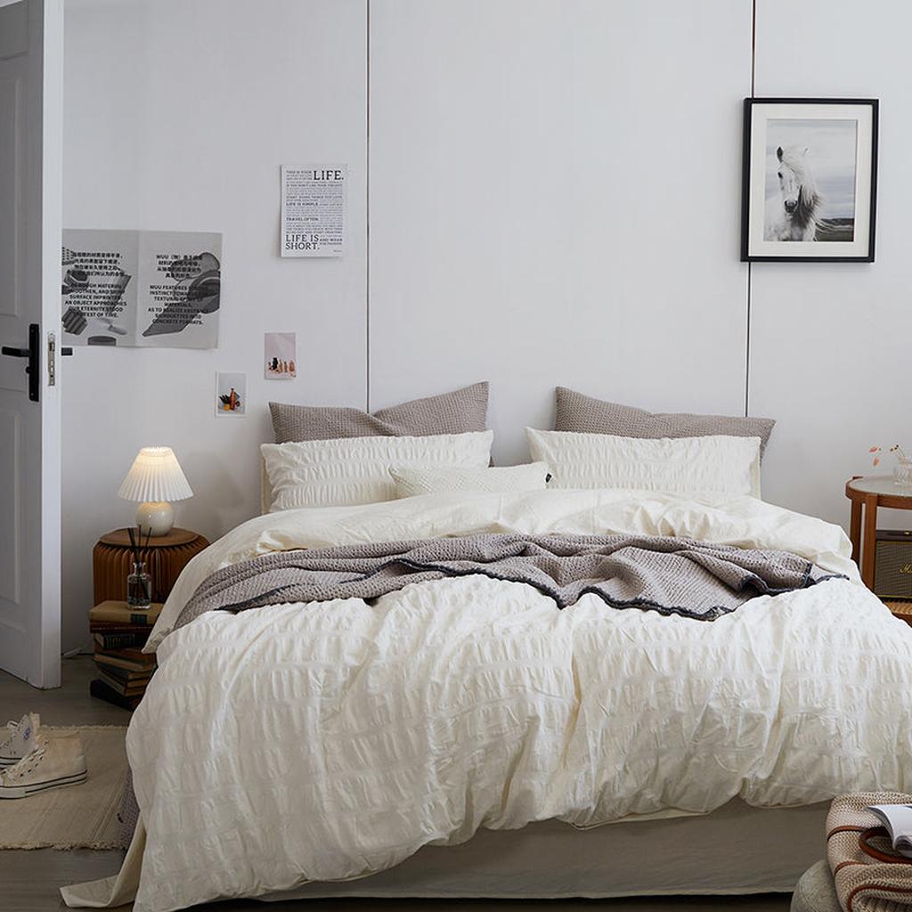
Your bed is the main visual moment in your room — it’s what your eyes land on first, and it quietly sets the whole mood. So instead of overthinking wall colors, you can completely shift the vibe just by switching up your bedding layers.
And that’s where the 2026 color trends come in.
This year’s palette feels like it was made for creating that soft, fluffy, restorative “spring cloud” bed.


Clean Girl Cloud Bed Energy


At the center of it all is Cloud Dancer white, a shade that’s quietly replacing the stark, sterile whites we’ve all gotten used to. Pantone highlighted this color for 2026, and it makes sense why it’s everywhere right now. Instead of that blinding, almost clinical look, this version feels softer, warmer, and a little more lived-in.
We’re moving away from harsh optic whites and leaning into tones that feel relaxed and breathable. This shade has a subtle putty warmth that instantly makes a room feel calmer and more elevated. If you love that clean, effortless aesthetic you see all over your feed, this is usually the base that makes everything else work. It’s light, airy, and makes even small rooms feel more open.
Discover with VANSILK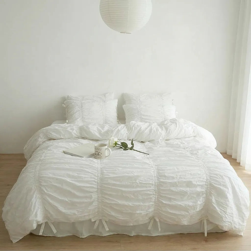
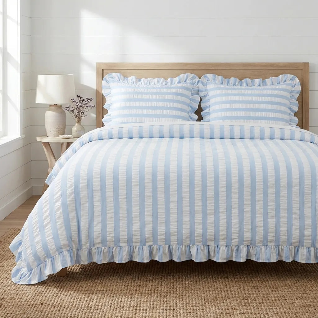
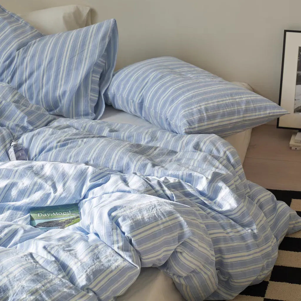
Calm Girl Reset Blue


This year, blue has been everywhere, especially those soft, icy tones that feel light and calming. And compared to Cloud Dancer white, a lot of designers are actually leaning toward blue as the color that will define 2026. This shade has been showing up across interior design spaces and fashion, and it feels like a direct response to how overstimulating everything has become.
Dark navy bedrooms are slowly fading out, and in their place are these soft, frosty blues that feel lighter and easier on the eyes.
There’s a reason people keep coming back to this color. It creates a sense of calm almost instantly. In a bedroom, it feels restorative and quiet, like your own personal reset space. If you want your room to feel soft, peaceful, and slightly airy, this is such an easy color to layer in.
Discover with VANSILK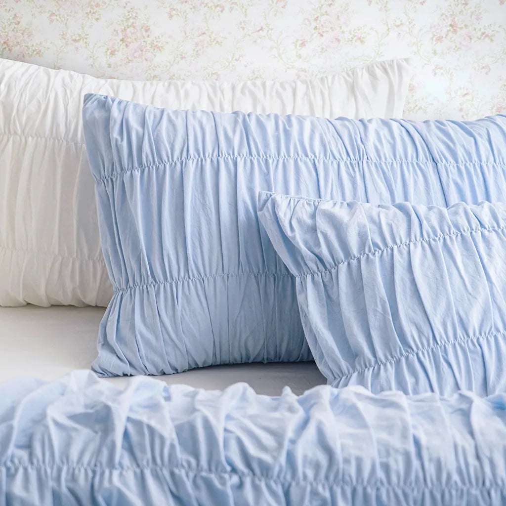
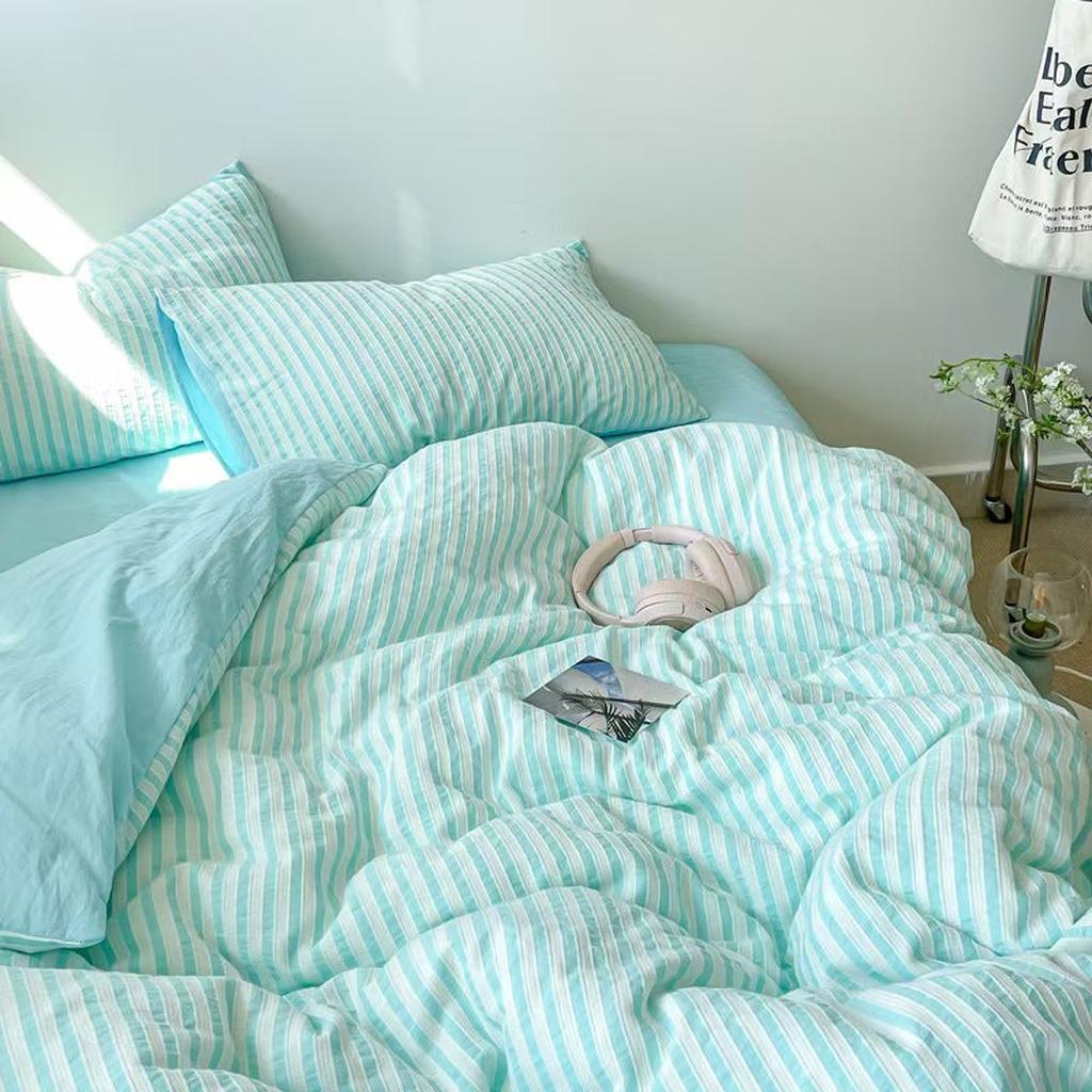
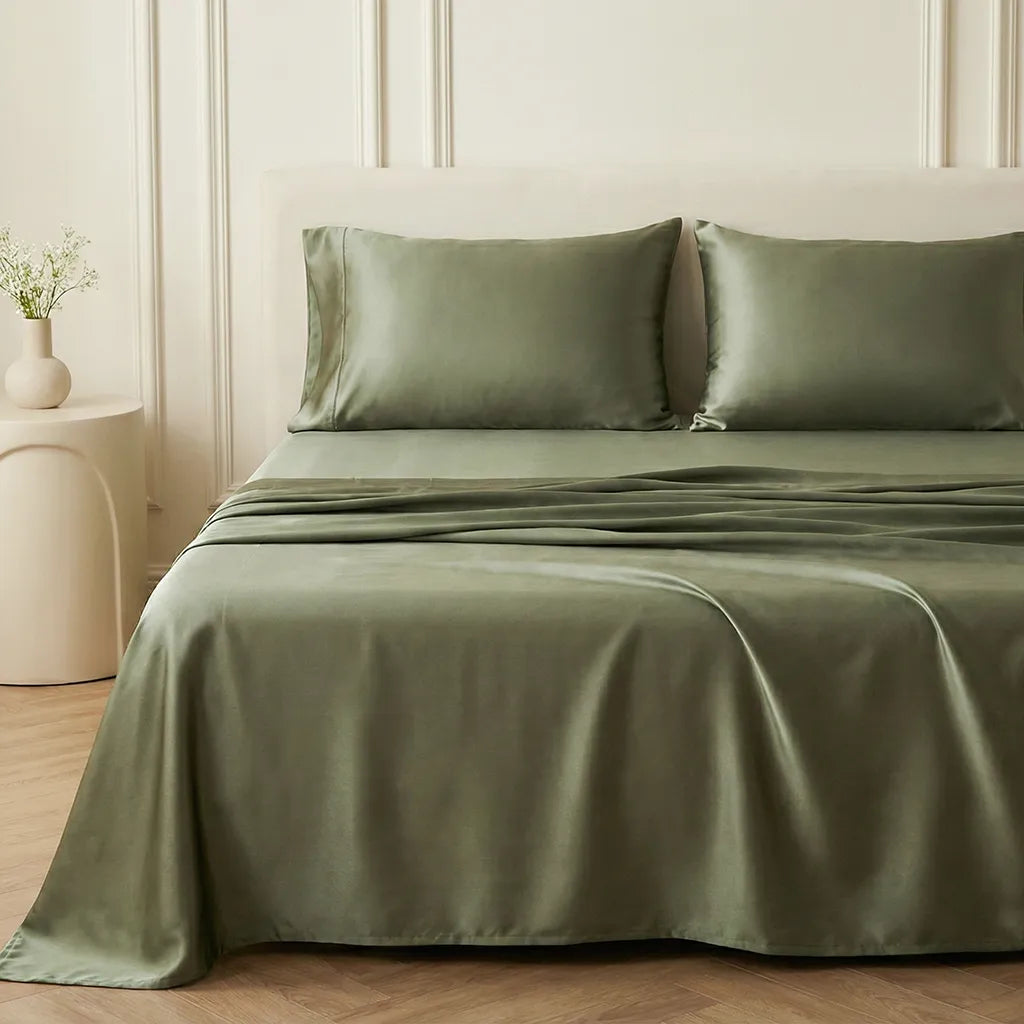
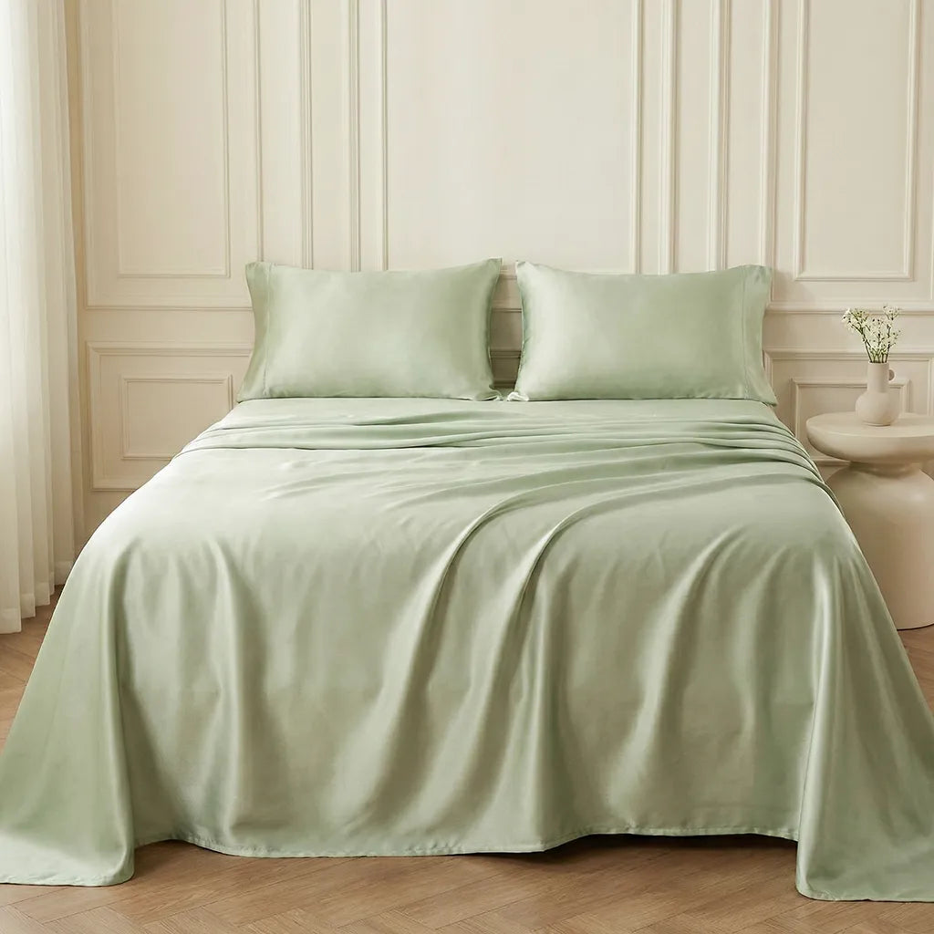
Low-Key Earthy Olive


Martini olive green fits perfectly into the shift toward more grounded, nature-inspired spaces. Brighter greens feel a little too sharp right now, while this deeper, muted tone brings in that natural feeling without overwhelming the room.
It works almost like a neutral, which is what makes it so versatile. When you layer it with crisp white bedding or warm wood tones, it creates that relaxed, earthy atmosphere that still feels styled. It’s cozy, balanced, and just a little bit elevated without trying too hard.
Discover with VANSILK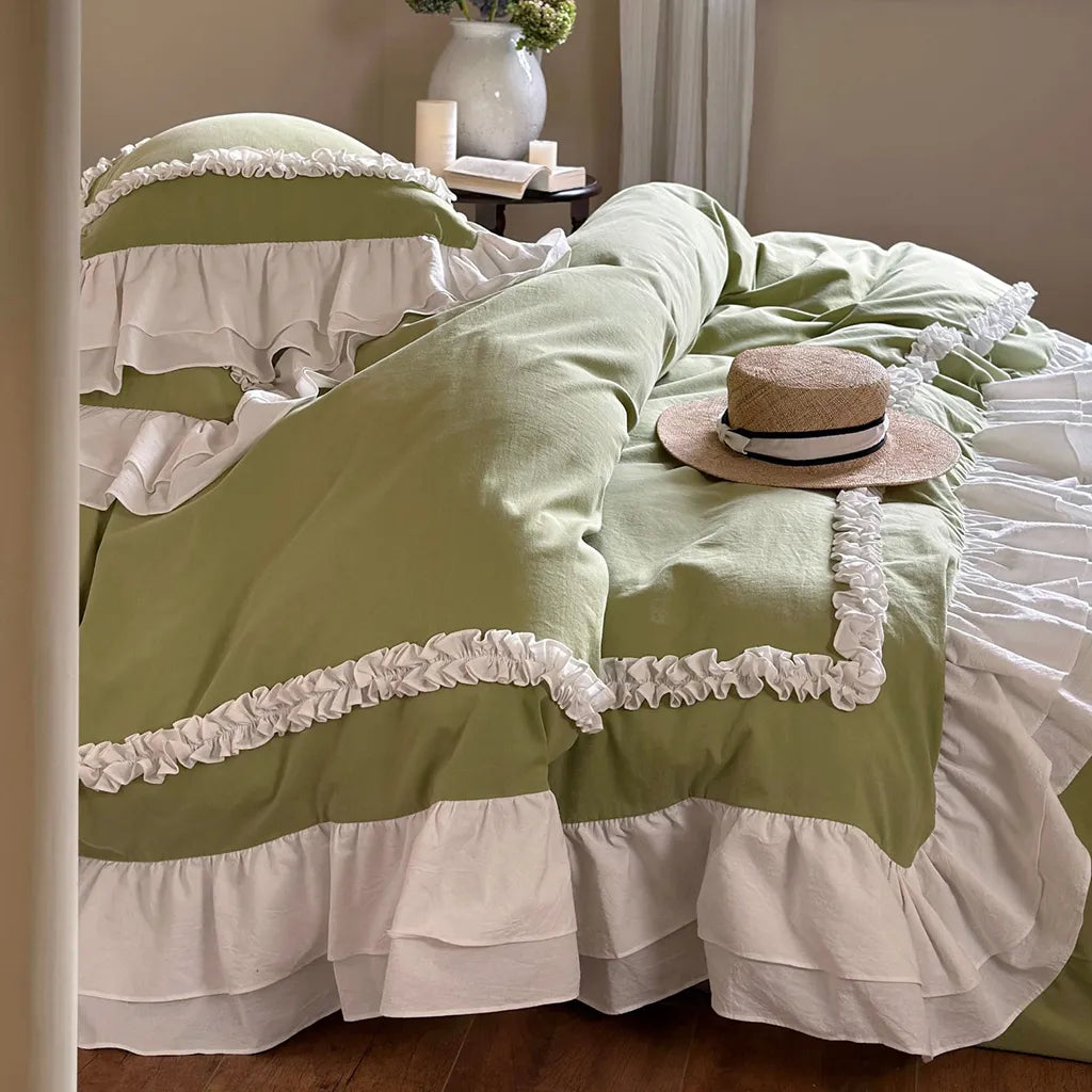
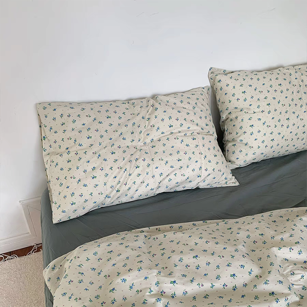
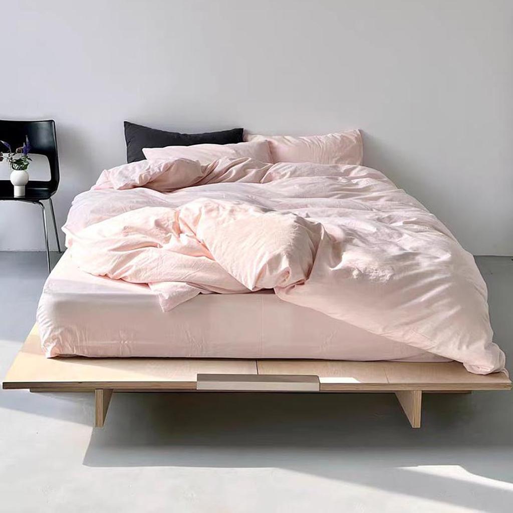
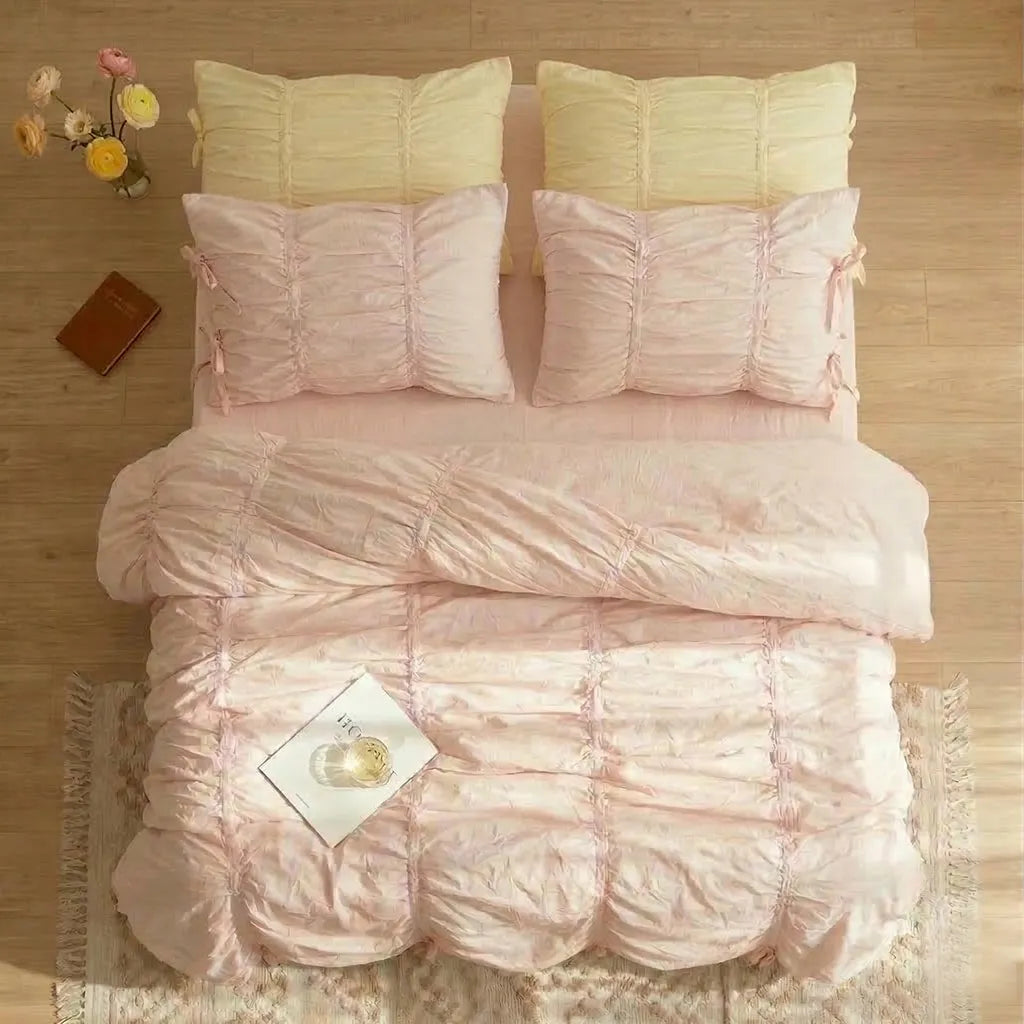
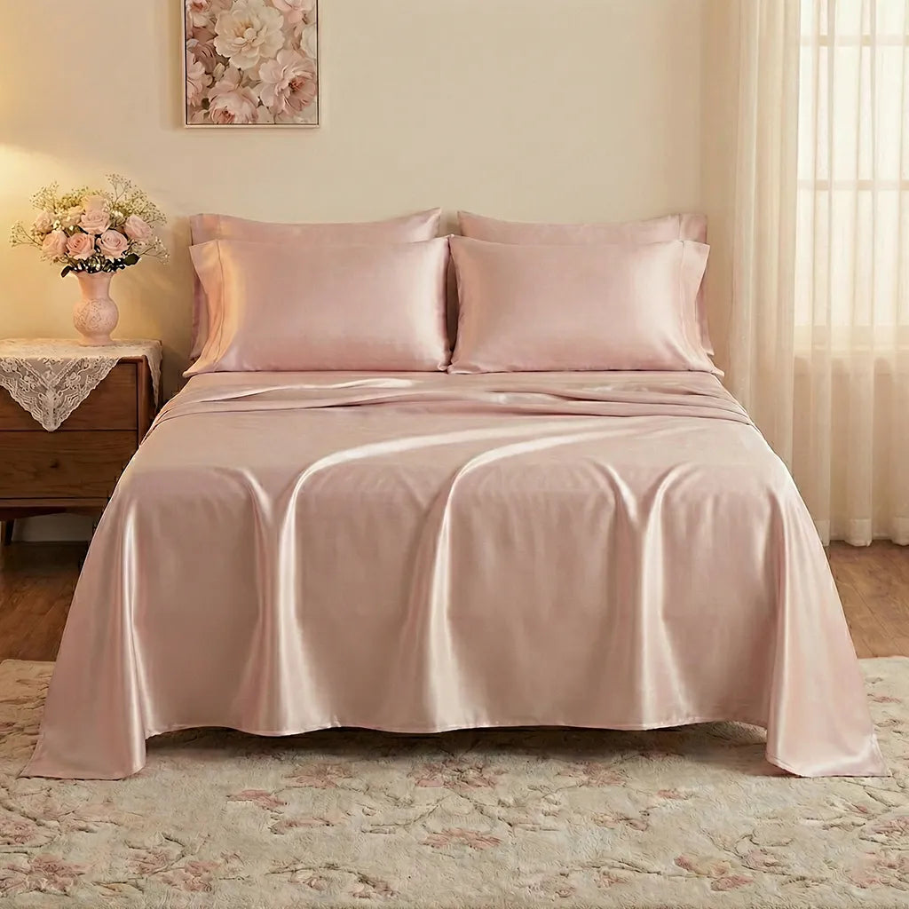
Soft Girl Candy Pink


Pink is still having a moment, but in a much softer way. Instead of bold, hot pinks, the focus has shifted to lighter, candy-toned shades that feel more relaxed and wearable.
This version of pink adds a playful, romantic touch without overwhelming the space. Even a small detail, like a pillowcase or a throw, can make your bed feel more styled and personal. It’s one of the easiest ways to bring in a little personality.
Discover with VANSILK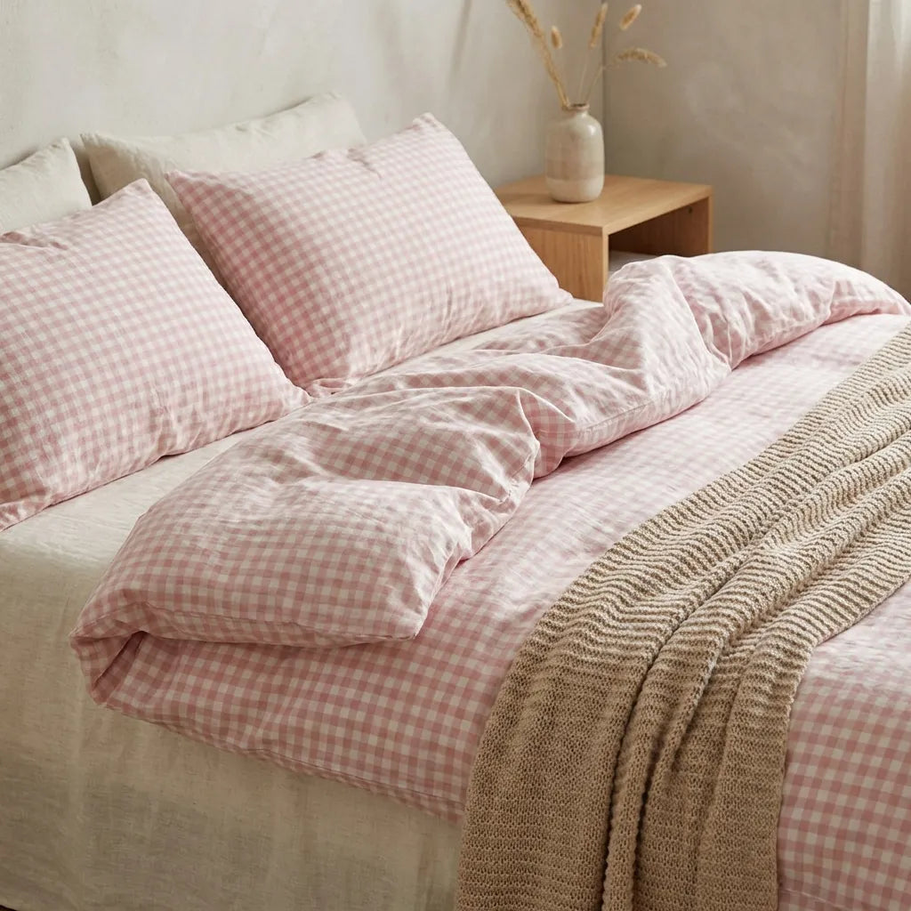
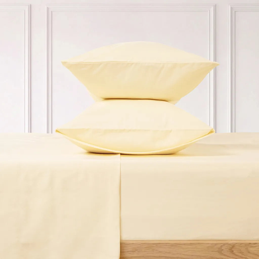
Sunshine Butter Yellow


Butter yellow is one of those colors that instantly lifts a space without feeling too loud. Instead of neon or heavy mustard tones, we’re seeing softer, creamy yellows that almost act like a neutral.
It adds warmth in a really subtle way, like a hint of sunlight in your room. When layered into a neutral bed, it keeps everything from feeling flat while still staying calm and cohesive. It’s soft, cheerful, and really easy to style.
Discover with VANSILK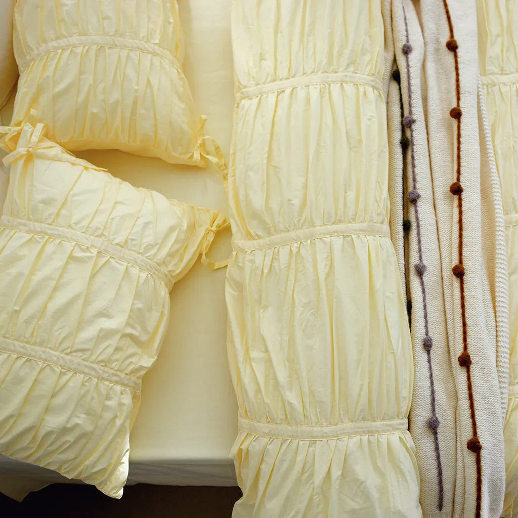
Soft layers, calming colors, and a bed that looks as good as it feels can completely change the mood of your room. It becomes somewhere you can slow down, reset, and actually enjoy being in. And when your bed feels that good, the whole room follows.
I’m curious - is there a color here you’re drawn to for 2026, or is it already part of your space?


